Met with TE team as part of my mentor review #1. I met in two sessions, with the back-end developers, and with the project managers.
Meeting Minutes W5 (w/the Software Devs)
Meeting Minutes W6 (w/the Project Managers)
Key Takeaways (synthesized by ChatGPT):
Meeting Minutes W5 (w/the Software Devs)
Meeting Minutes W6 (w/the Project Managers)
Key Takeaways (synthesized by ChatGPT):
Demo Website Development:
- Decision to start the demo website from scratch rather than off TE's existing structure.
- Bootstrap as a CSS framework recommended, no need to learn Knockout.js.
- Decision to start the demo website from scratch rather than off TE's existing structure.
- Bootstrap as a CSS framework recommended, no need to learn Knockout.js.
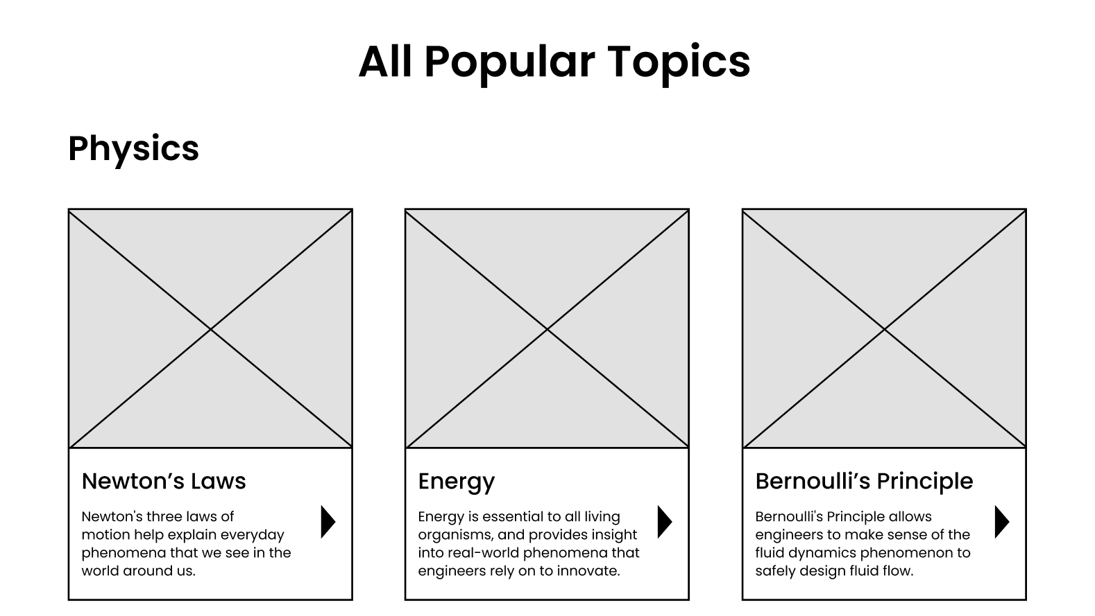
User Testing Feedback (PT Page & Wireframes):
PT Page Issues:
- Navigation: Dropdown menu is difficult to use and too long. Users rely on browser “back” button, not site navigation.
- Popular Topics: “All Popular Topics” is at the bottom and unclear whether topics are searched or curated. The term itself is ambiguous.
- PT Page Organization: Needs clearer distinctions between lessons/activities and explanation of purpose.
Recommendations:
- Add a button or breadcrumbs to improve navigation.
- Include a blurb to explain what PT is.
- Ensure no text overflow and clarify if PTs are curated or searched.
- Add a button or breadcrumbs to improve navigation.
- Include a blurb to explain what PT is.
- Ensure no text overflow and clarify if PTs are curated or searched.
Wireframes Feedback:
- Grid Layout: Users like it but prefer topics organized by discipline. Mixed reactions on whether a “sort by” button is needed (standards or other filters).
- User Feedback: “Popular Topics” should be redefined to avoid ambiguity. Organize tiles clearly and make sure text doesn’t overflow.
- Grid Layout: Users like it but prefer topics organized by discipline. Mixed reactions on whether a “sort by” button is needed (standards or other filters).
- User Feedback: “Popular Topics” should be redefined to avoid ambiguity. Organize tiles clearly and make sure text doesn’t overflow.
UI Design Suggestions:
- Keep the tiles and text as they are.
- Add an “advanced search” button at the bottom.
- Consider responsiveness of tile sizes depending on the window size.
- Group topics into sub-groups, and apply different color overlays for better categorization.
- Keep the tiles and text as they are.
- Add an “advanced search” button at the bottom.
- Consider responsiveness of tile sizes depending on the window size.
- Group topics into sub-groups, and apply different color overlays for better categorization.
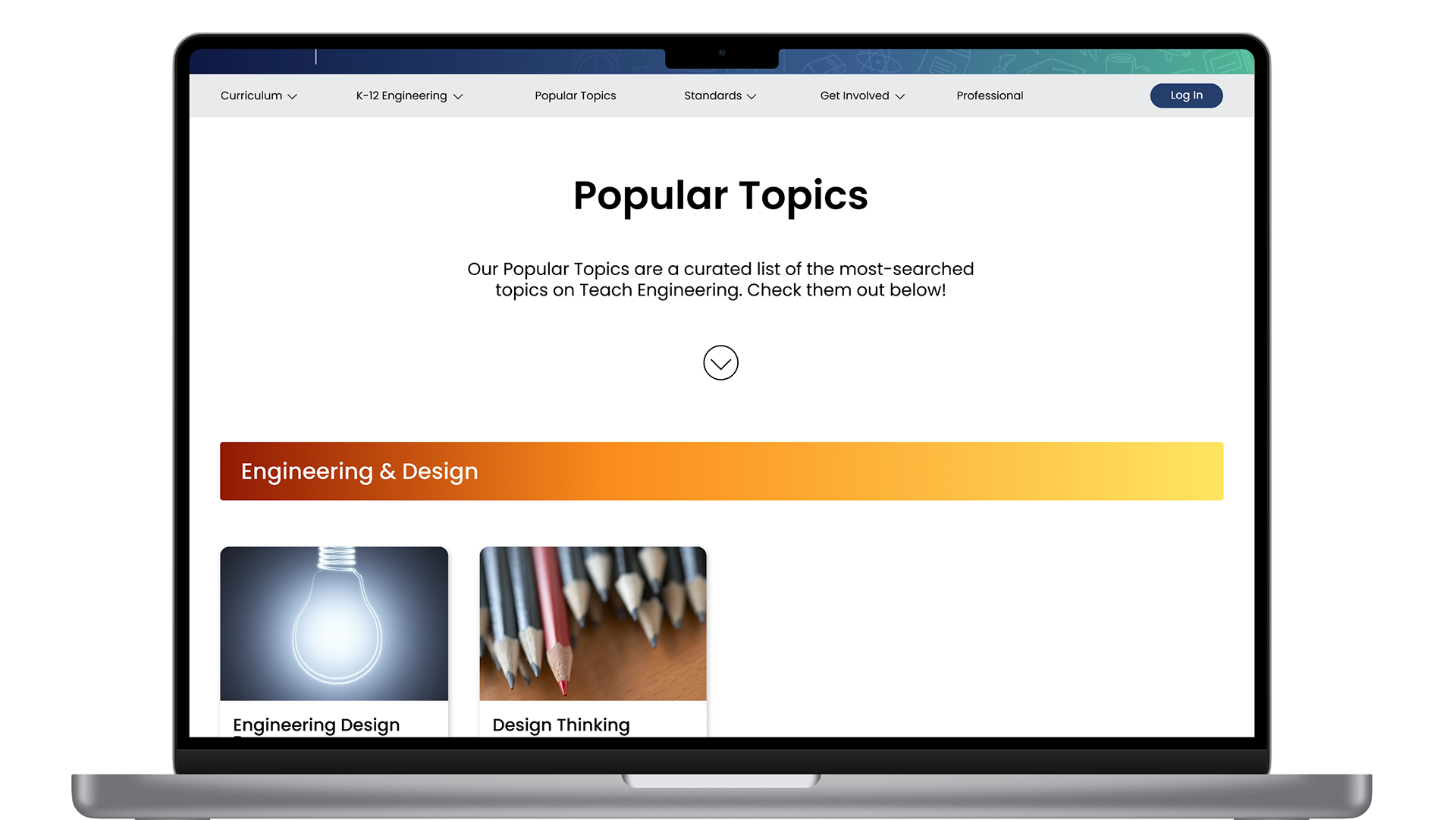
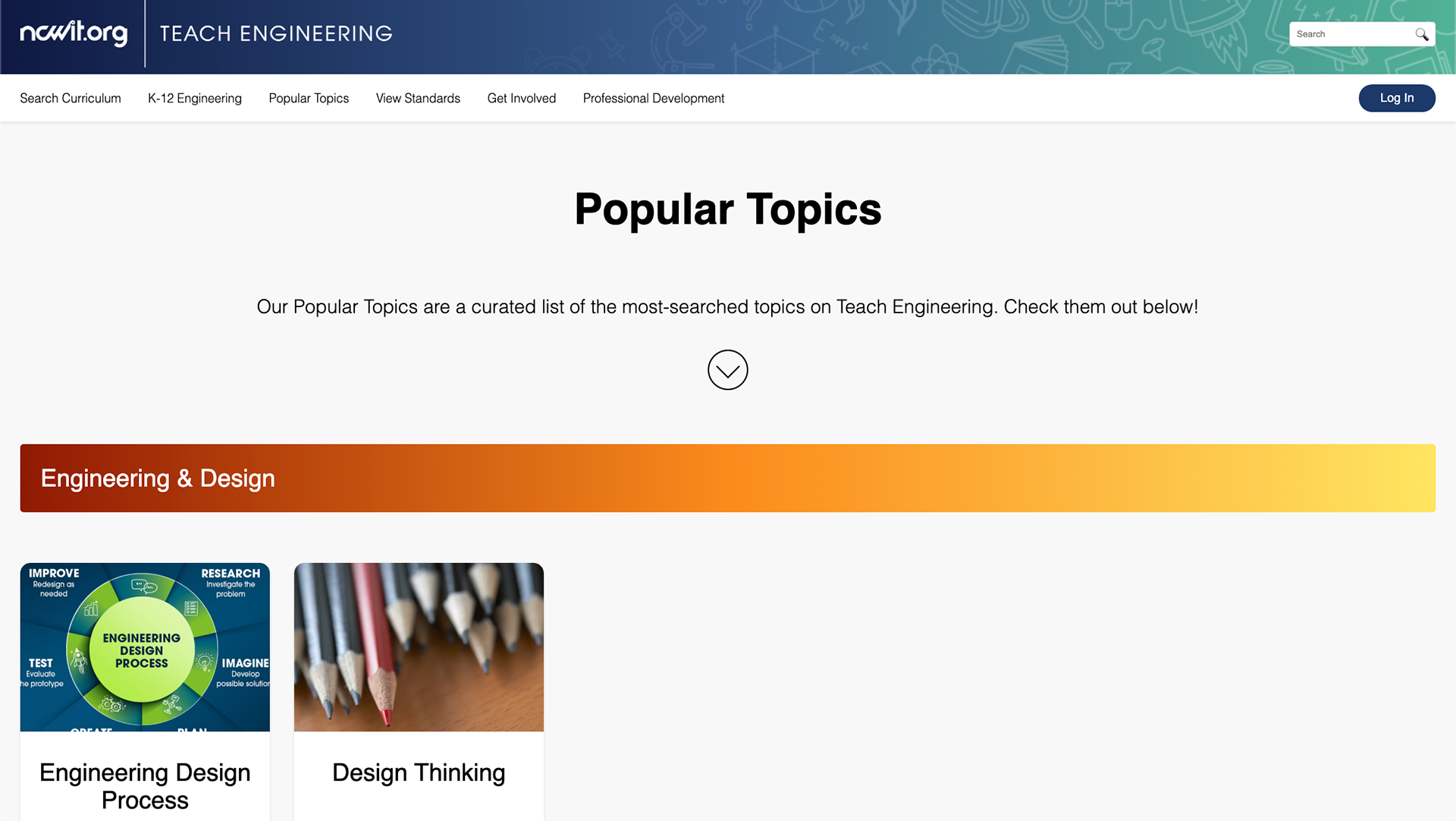
Wireframe Iteration (Hi-Fi Wireframes):
Design Adjustments:
- Simplified header/footer.
- Moved “My TE” to “Log In” for clarity.
- Switch to photographic imagery.
- Removed advanced search at the bottom.
- Test layouts for better consistency and responsiveness.
- Simplified header/footer.
- Moved “My TE” to “Log In” for clarity.
- Switch to photographic imagery.
- Removed advanced search at the bottom.
- Test layouts for better consistency and responsiveness.