Met with my mentor outside of TE, James Tran in an hour-long feedback/strategy session.
Key Takeaways (synthesized by ChatGPT):
2. High-Fidelity Wireframes Feedback
Design Adjustments:
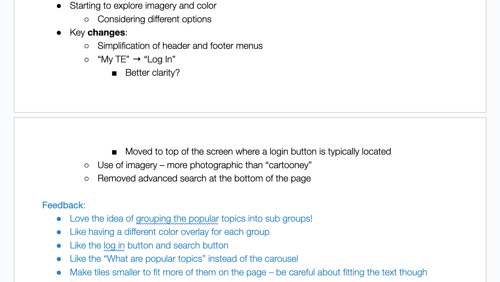
- Simplified header/footer menus.
- Changed "My TE" to "Log In" for clarity, placed at the top.
- Using more photographic imagery instead of cartoon-like visuals.
- Removed the advanced search at the bottom.
- Changed "My TE" to "Log In" for clarity, placed at the top.
- Using more photographic imagery instead of cartoon-like visuals.
- Removed the advanced search at the bottom.
Technical & Formatting Issues:
- Scope concerns—topics like "physics" then "pulleys" feel mismatched.
- Figma designs are too large for screens—standardize dimensions and font sizes before coding.
- Standardize padding (increments of 8 or 4).
- Icons should generally be 24x24 px.
- Reduce font sizes for better readability.
- Each subgroup should have a distinct colored banner.
- The tile arrow needs a new placement.
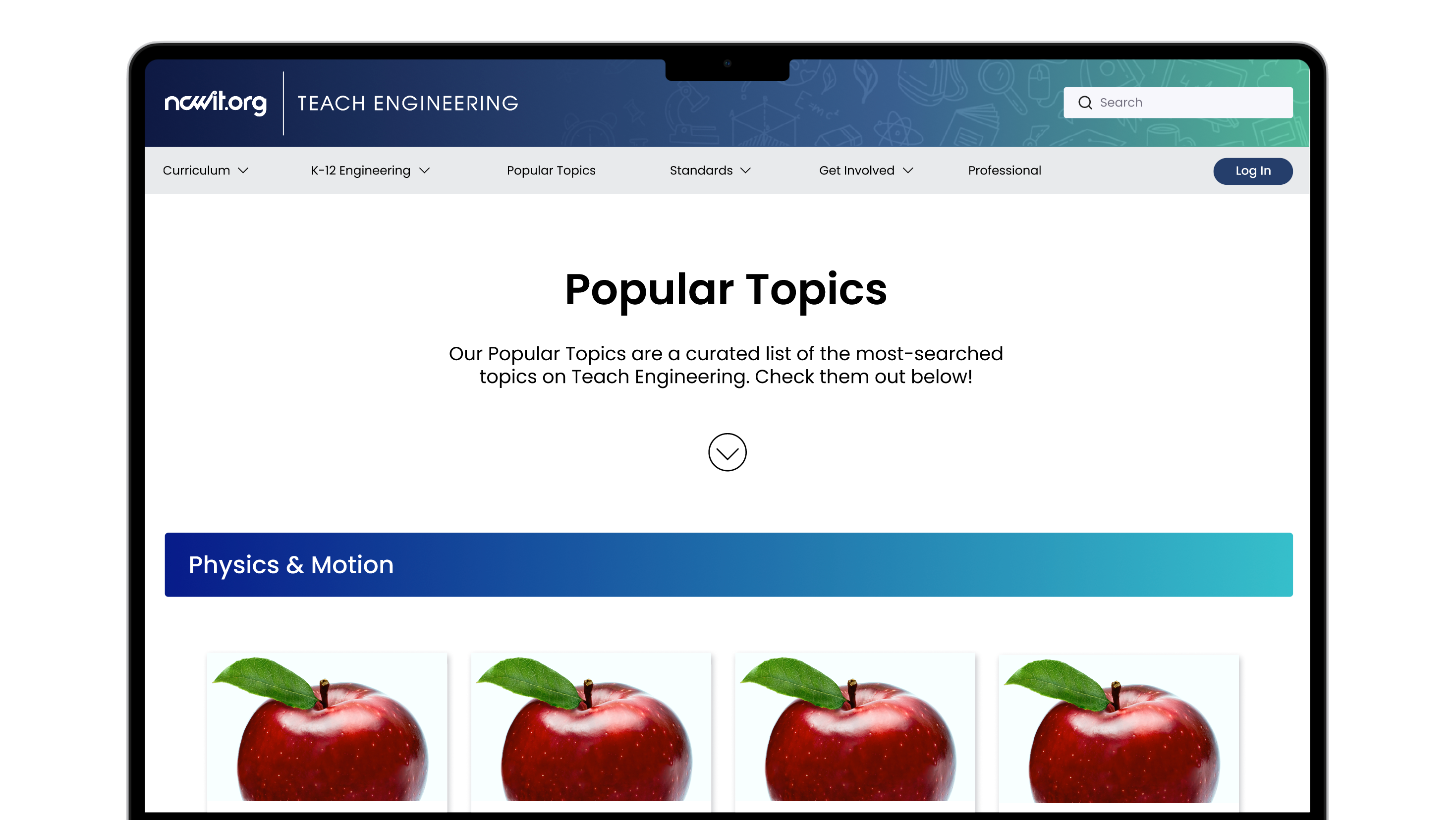
- The carousel feels redundant on the PT page—better suited for the homepage.
- Mobile Design: Avoid using a hamburger menu.
- Figma designs are too large for screens—standardize dimensions and font sizes before coding.
- Standardize padding (increments of 8 or 4).
- Icons should generally be 24x24 px.
- Reduce font sizes for better readability.
- Each subgroup should have a distinct colored banner.
- The tile arrow needs a new placement.
- The carousel feels redundant on the PT page—better suited for the homepage.
- Mobile Design: Avoid using a hamburger menu.